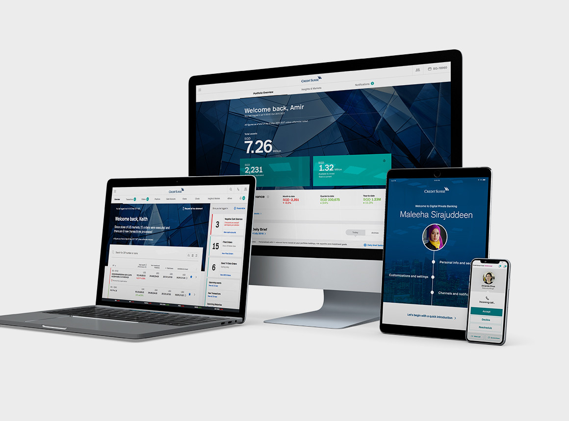
Google Pay

Launching Google Pay

Product & UX Design

Project Details

  • Client

    Google

  • Team

    Google and
    Arts & Letters

  • Date

    Winter 2019

Launching the new Google Pay exclusively for Singaporeans

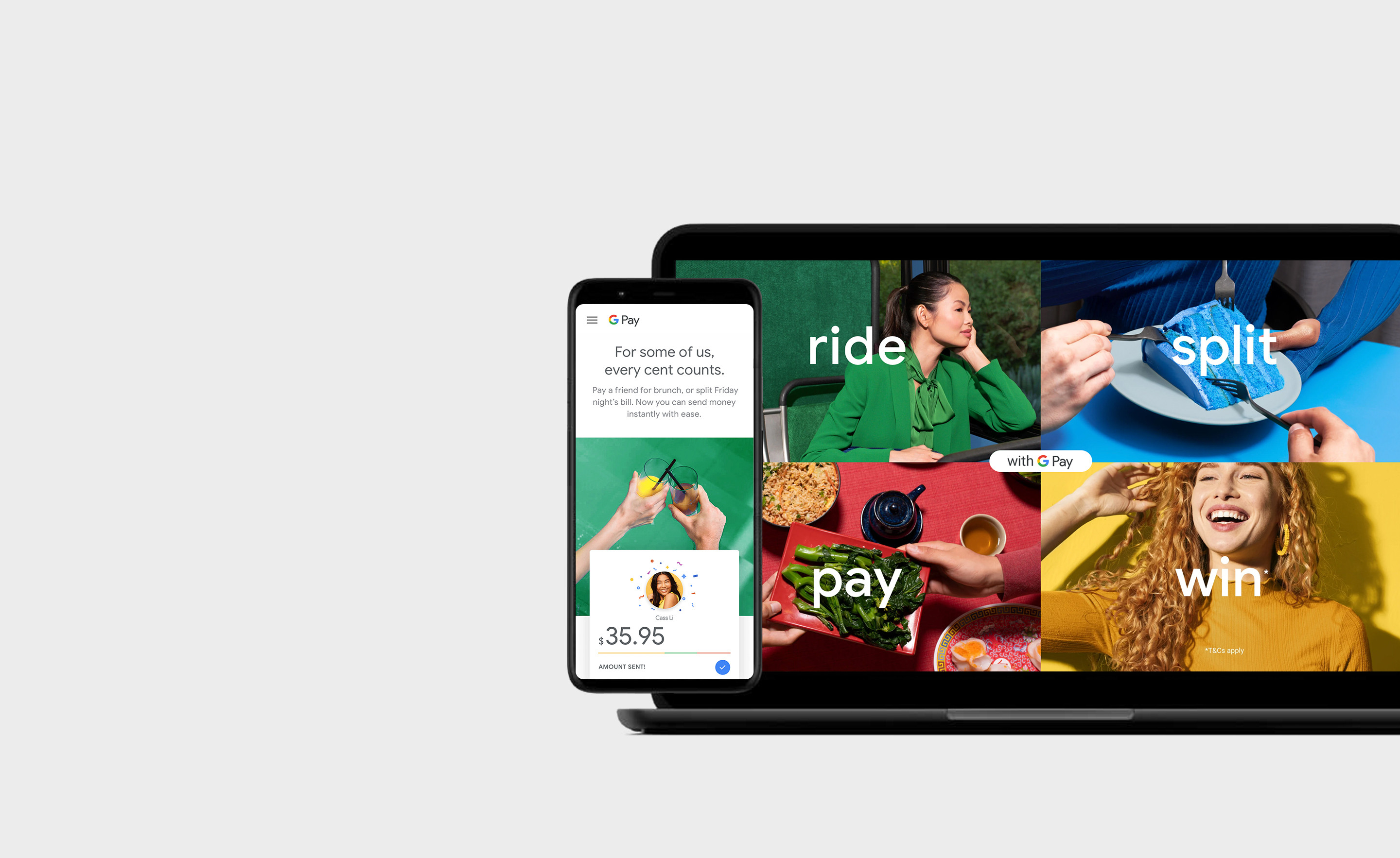
The Google Pay team needed to introduce not only their new digital payments app but also communicate the dramatic ways in which users could now do more with their money. Research indicated that GPay adoption depended on check-list behavior, and the proposed solution was a series of pages with fun and lively use case demonstrations. Because Singapore was chosen as the initial launch market, the first iteration was hyper localized to include familiar and beloved brands, restaurants, and experiences. Subsequent versions have included more modular content and varied use cases in order to be completely scalable across APAC.
Read more Read less

Summary

The Google Pay app relaunched as Google Pay 3.0 to become a flagship product redefining Google’s role in finance. The previous version had struggled in Singapore due to limited local relevance and differentiation in a competitive market. This relaunch aimed to create a compelling, user-friendly app that addressed local needs while aligning with Google’s vision of accessible and helpful money management for all.

To address these challenges, the project team developed a mobile-first B2C website for Google Pay 3.0, aimed at educating users and enhancing engagement through intuitive features. This site built trust by highlighting Google Pay’s unique offerings and local partnerships, positioning it as more than a payment app—a tool for expanding financial opportunities for users in Singapore.

GPay - You + GPay Concept

Highlighting local perspectives and focusing on how Google Pay appeals to Singaporeans

GPay - You + GPay Use Case 01
GPay - You + GPay Use Case 02

Examples of how Singaporeans might like to use GPay locally and abroad

Planning

Rather than relying on traditional wireframes, expressive page outlines were created to streamline the process and foster meaningful discussions with the Google Pay team. These outlines went beyond basic layout; they captured elements of emotion, user mindset, and the overall journey, enabling the marketing team to quickly align on the purpose and intention behind each page.

These initial outlines evolved into more detailed, diagrammatic plans that included annotations and comprehensive information on each section, component, and functionality. This step provided a clear blueprint for the subsequent wireframing process, ensuring it was both efficient and transparent.

GPay - Sitemap Approach

Planning the main navigation

GPay - Page Outline 01
GPay - Page Outline 02
GPay - Page Outline 03

Outlines and analysis of existing pages

Wireframes

Wireframes were created in Sketch and extensively annotated to include both page links and user actions, providing a clear blueprint for user interactions. Special attention was given to key elements like sign-up flows and email capture modules, with additional wireframes dedicated to demonstrating how these interactions could be smoothly executed within limited screen space, maintaining a mobile-first approach.

The wireframes proved valuable for the visual design team, helping them develop advanced concepts and integrate animations to enhance key app moments. With the detailed mobile wireframes, separate desktop versions weren’t needed; designers easily extrapolated layouts for a cohesive experience across devices.

GPay - Wireframes Preview

Mobile page wireframes with user pathways

GPay - Wireframes - Set 01
GPay - Wireframes - Set 02

Details from the new GPay homepage

Visual Design

Following the Google design system, pages for mobile, desktop, and tablet were developed in alignment with the strategic vision set out in the wireframes. These pages went through multiple rounds of refinement, both pre- and post-launch, allowing for iterative improvements that enhanced the user experience and visual cohesion across devices.

Throughout the visual design phase, stronger use cases were continually tested and incorporated to clearly communicate the benefits for Singaporean users. As the designs evolved, working examples of app features were integrated into the pages, providing users with tangible demonstrations of core functionalities and reinforcing the app’s value.

GPay - Mobile Designs Trio

Google Pay mobile landing page

GPay - Mobile Designs
GPay - Tablet Designs

Mobile and tablet designs

GPay - Skip The Wait
GPay - Bank Payment

App features for Singaporean users

Iā€™m currently leading the User Experience team at Taoti in Washington, D.C.

As Director of UX Design I'm looking after (and growing) an innovative, lean and effective team that delivers value to our clients. Get in touch with me to discuss speaking engagements and other professional opportunities.

My full work history is available on LinkedIn at btiny.link/linkedin

Download CV
Check all details Before sending
image descriptionimage description

Your message was sent

Thank you!